28-07-2025-Mechanical Measurements - Trend Lines[EN]-[IT]
~~~ La versione in italiano inizia subito dopo la versione in inglese ~~~
ENGLISH

28-07-2025-Mechanical Measurements - Trend Lines[EN]-[IT]
With this post, I would like to provide a brief overview of the topic mentioned above.
(code notes: X-96)
Trend Lines

Image created with artificial intelligence, the software used is Microsoft Copilot
Preface
First of all, welcome to this new series of educational articles dedicated to Mechanical and Thermal Measurements.
Mechanical and thermal measurements are fundamental in management engineering, especially important when performing quality control.
Mechanical measurements involve quantities such as length, force, velocity, or acceleration, while thermal measurements refer to temperature, thermal conductivity, and heat capacity.
Trend line
Below, I'll try to explain the process for obtaining a trend line.
First, we need to understand what a trend line is. This is a curve that represents the general trend of a data set and is used to understand the system we've measured, make predictions, and evaluate the correlation between data.
Examples
Let's take as an example a data set in which we insert data relating to a central value on the x-axis and data of a given frequency in % on the y-axis.
Let's imagine creating a histogram chart with this hypothetical data and obtaining the following result.
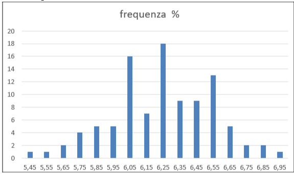
Chart obtained with Excel software
Below is the same chart with the trend line Linear
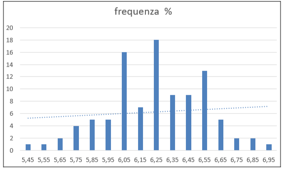
graph obtained with Excel software
A linear trend line represents the relationship between two variables by attempting to minimize the overall distance between the observed points and the line itself. This line is used to identify a trend, that is, to understand whether it is increasing or decreasing. It is also used to make predictions and evaluate the correlation between the two quantities being studied.
Below is the same chart with the moving average trendline
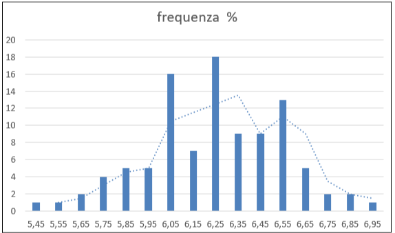
chart obtained with Excel software
The moving average is primarily used for data that varies over time, especially when we know the chart will exhibit fluctuations or noise in the data, so it is a tool that helps us interpret the data.
The moving average is a technique that calculates the average of a certain number of consecutive values in a time series. We can say that this trendline is used to smooth out local variations and highlight the overall trend, as it is assumed that the chart exhibits fluctuations that could lead to an incorrect overall reading of the situation.
A moving average trendline represents the average movement of data over time.
Let's give a descriptive example.
Suppose we have a series of daily measurements of the price of a precious metal. If we consider applying a moving average trendline to the chart, we would do the following:
Suppose we apply a 3-day moving average. The first point on this line will be the average of days 1 through 3, the second point will be the average of days 2, 3, and 4, and so on...
Conclusions
When we take measurements, we can evaluate the data by selecting them through the creation of graphs. After creating the graphs, we can also study them by inserting trendlines (linear, parabola, moving average, etc.). The trendline helps us better understand the overall trend by attenuating data that could lead to incorrect conclusions. Trendlines are used primarily to better visualize trends, make more accurate forecasts, and reduce noise, i.e., random fluctuations. They are important for reaching quality conclusions.
Question
The trend line is a concept that seems to date back to the 19th century. Did you know that the first to formalize the concept of a trend line was the explorer and biologist Francis Galton (1822-1911)? Did you know that Galton was Charles Darwin's cousin? Did you know that Galton introduced the concept of regression to the mean to graphs, laying the foundation for many statistical tools used today in management engineering?
![]()
ITALIAN

28-07-2025-Misure meccaniche - Linee di tendenza[EN]-[IT]
Con questo post vorrei dare una breve istruzione a riguardo dell’argomento citato in oggetto
(code notes: X-96)
Linee di tendenza
immagine creata con l’intelligenza artificiale, il software usato è Microsoft Copilot
Premessa
Innanzitutto benvenuti a questa nuova serie di articoli educativi dedicati alle Misure meccaniche e termiche.
Le misure meccaniche e termiche sono fondamentali nell’ingegneria gestionale, importanti soprattutto quando si effettua il controllo qualità.
Le misure meccaniche riguardano grandezze come la lunghezza, la forza, la velocità o l’accelerazione, mentre le misure termiche si riferiscono alla temperatura, alla conduttività termica e alla capacità termica.
Linea di tendenza
Qui di seguito provo a spiegare il processo per ottenere una linea di tendenza.
Innanzitutto dobbiamo comprendere che cosa è una linea di tendenza. Questa è una curva che rappresenta l’andamento generale di un insieme di dati e serve per comprendere il sistema che abbiamo misurato, per fare previsioni e valutare la correlazione tra i dati.
Esercizi
Prendiamo come esempio una serie di dati in cui sull’asse delle ascisse inseriamo dei dati relativi ad un valore centrale e sull’asse delle ordinate inseriamo i dati di una determinata frequenza in %.
Pensiamo di creare con questi dati ipotetici un grafico a istogramma ed ottenere il risultato seguente
grafico ottenuto con il software Excel
Qui di seguito lo stesso grafico con la linea di tendenza lineare
grafico ottenuto con il software Excel
Una linea di tendenza lineare rappresenta la relazione tra due variabili cercando di minimizzare la distanza complessiva tra i punti osservati e la retta stessa. Questa linea viene usata per individuare un trend, cioè per capire se questo è crescente o decrescente. Inoltre viene usata per fare previsioni e valutare la correlazione tra le due grandezze studiate.
Qui di seguito lo stesso grafico con la linea di tendenza a media mobile
grafico ottenuto con il software Excel
La media mobile viene usata soprattutto per dati che variano nel tempo soprattutto quando sappiamo che il grafico presenterà fluttuazioni o rumore nei dati, quindi è uno strumento che ci aiuta nella lettura.
La media mobile è una tecnica che calcola la media di un certo numero di valori consecutivi in una serie temporale. Possiamo dire che questa linea di tendenza viene usata per attenuare le variazioni locali e mettere in evidenza l’andamento generale, in quanto si presuppone che il grafico presenta delle fluttuazioni che potrebbero portare ad una lettura generale della situazione non corretta.
Una linea di tendenza a media mobile rappresenta l’andamento medio dei dati nel tempo.
Provo a fare un esempio descrittivo.
Pensiamo di avere una serie di misure giornaliere del prezzo di un metallo prezioso. Se pensiamo di applicare al grafico una linea di tendenza a medie mobili significa che faremo quanto descritto qui di seguito.
Supponiamo di applicare una media mobile a 3 giorni, il primo punto di questa linea sarà la media dei giorni da 1 a 3, il secondo punto sarà la media dei giorni 2,3 e 4, e così via…
Conclusioni
Quando effettuiamo delle misurazioni possiamo valutare i dati selezionandoli tra loro tramite la creazione di grafici. Dopo aver creato i grafici possiamo studiarli inserendo anche delle linee di tendenza (lineare, parabola, media mobile, ecc…ec…). La linea di tendenza aiuta a comprendere meglio l'andamento generale attenuando i dati che potrebbero far trarre delle conclusioni sbagliate. Le linee di tendenza vengono usate soprattutto per visualizzare meglio i trend, per fare previsioni più corrette per ridurre il rumore, cioè le oscillazioni casuali. Sono importanti per arrivare a delle conclusioni di qualità.
Domanda
La linea di tendenza è un concetto che sembra arrivare dal XIX secolo. Lo sapevate che il primo a formalizzare il concetto di linea di tendenza fu l’esploratore e biologo Francis Galton (1822-1911)? Lo sapevate che Galton fu il cugino di Charles Darwin? Lo sapevate che Galton introdusse nei grafici il concetto di regressione verso la media gettando le basi per molti strumenti statistici che oggi vengono usati in ingegneria gestionale?
THE END
Congratulations @stefano.massari! You have completed the following achievement on the Hive blockchain And have been rewarded with New badge(s)
You can view your badges on your board and compare yourself to others in the Ranking
If you no longer want to receive notifications, reply to this comment with the word
STOPCheck out our last posts:
Passiamo alla statistica! La media mobile visivamente rende molto e secondo me complessivamente è anche più utile rispetto alla linea di tendenza
!PIZZA
Anche a me piace di più la media mobile, in quanto mantiene l’andamento generale della serie. La linea di tendenza è importante per capire bene il trend, ma non permette di visualizzare bene l’andamento locale. !hiqvote
$PIZZA slices delivered:
@davideownzall(2/15) tipped @stefano.massari
Come get MOONed!
Wow I really love how you explained this much more better for me. Thank you for sharing this
Hi Goshen, in this first article on mechanical and thermal measurements, I discussed how to take measurements and display them on graphs. I then discussed trend lines on graphs, which help us better understand the measurements we've taken or are monitoring. Most importantly, I discussed what a trend line and a moving average are. In short, a trend line helps highlight the overall behavior of a data series; a moving average, on the other hand, helps filter out noise to better visualize local trends. Thanks for leaving a comment. !BBH
A massive congratulations to all those who are duly supported. This will mean a whole lot to them
https://x.com/jewellery_all/status/1949922522348343807
https://x.com/lee19389/status/1950022315749892228
#hive #posh
Trend, a word that makes me think, in previous times they were implemented very well, currently the trend is that men want to be like women hahaha, they want to be like animals, they want a number of nonsense that they don't even know what they want hahaha
Hi Lu, thanks for leaving a nice comment. In this post, I tried to talk about trend lines. A trend line is a straight line that represents the general trend of a set of data over time. Inserting it into a graph (it's very easy with Excel) helps visualize the graph's overall behavior and can help predict future values. This is useful for us investors. !LADY
View or trade
LOHtokens.@stefano.massari, you successfully shared 0.1000 LOH with @lupega and you earned 0.1000 LOH as tips. (1/3 calls)
Use !LADY command to share LOH! More details available in this post.
@stefano.massari, I paid out 0.185 HIVE and 0.035 HBD to reward 9 comments in this discussion thread.