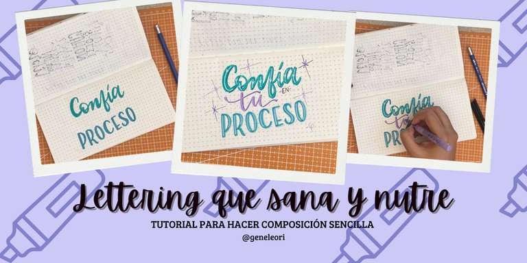
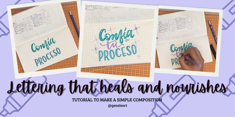
Lettering que sana y nutre (ESP-ENG)
¡Hola hivers!💜
Espero que se encuentren bien y felices. La iniciativa de arte y bienestar entre @holoslotus y @hivearte me tiene super feliz y emocionada, literal me siento como un pez en el agua y me encanta poder compartir con ustedes cosas que me ayudan a sanar y una de esas cosas es el lettering.
El lettering es la forma más bonita que tengo para decirme las cosas, pero sobre todo el hacer composiciones de frases positivas me ayuda muchisimo. Las frases positivas llenas de letras bonitas con colores vivos o que te reconfortan tienen un efecto positivo en las personas y pueden ayudarlas a cambiar su estado de ánimo.
Estos días han sido algo fuertes para mí por motivos personales. Así que para encontrar un poquito de paz decidí ilustrar una frase que siempre me calma: “Confía en tu proceso”. Literal es una frase que tengo ilustrada de muchas formas y dibujarla me ayuda a encontrar la paz. Les mostrare como hice esta composición:
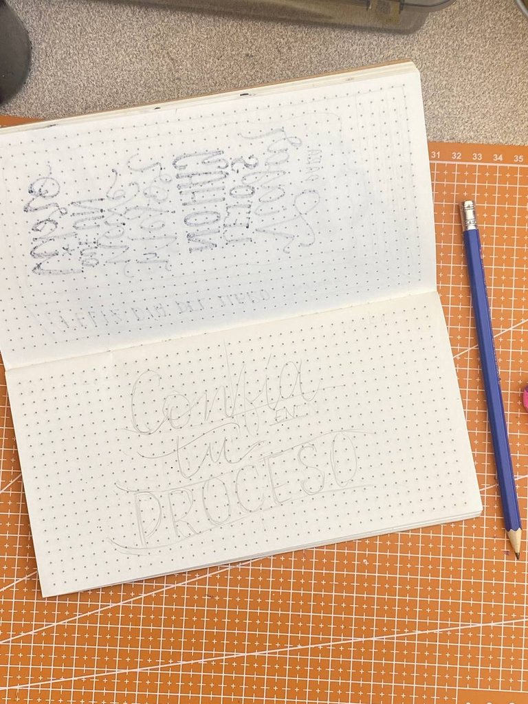
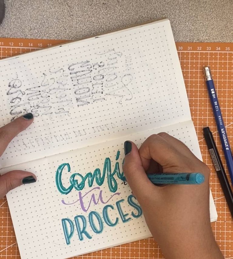
Lo primero fue hacer un boceto. Las composiciones en lettering son como rompecabezas donde cada palabra es una pieza a encajar. Me gusta usar cajas de distorsión para darle forma a las letras. En este caso, elegí una onda para la palabra “Confía” y otra onda para “proceso”. Para “tu” use el espacio entre “confía” y “proceso” y busque cómo encajarla. El conector “en” también encajo bajo “confia”.
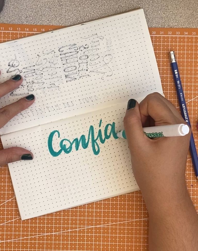
Luego elegí una paleta de colores que me encanta: turquesa y morado en marcadores de pintura acrílica. Empecé con “Confía” en color turquesa con un estilo cursivo, haciendo el trazo grueso un poco más grueso de lo usual.
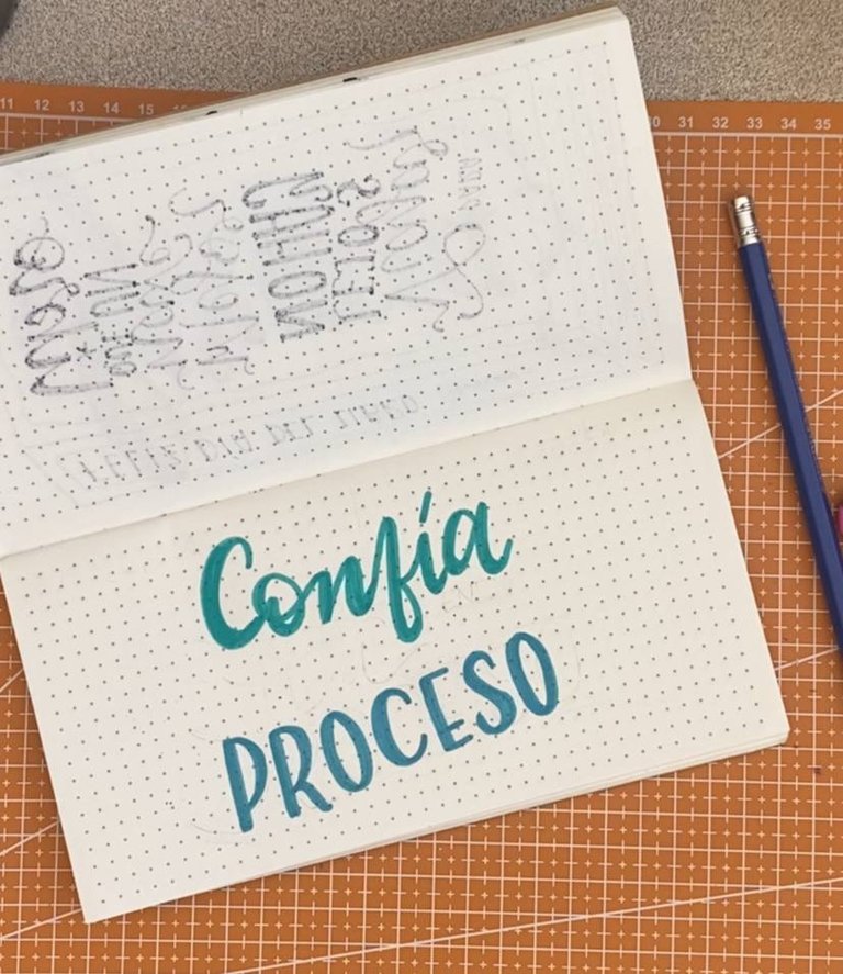
Seguí con “proceso” en un tono entre turquesa y azul, pero usando letras rectas con la línea media más baja, eso hace que las letras se vean más divertidas y frescas.
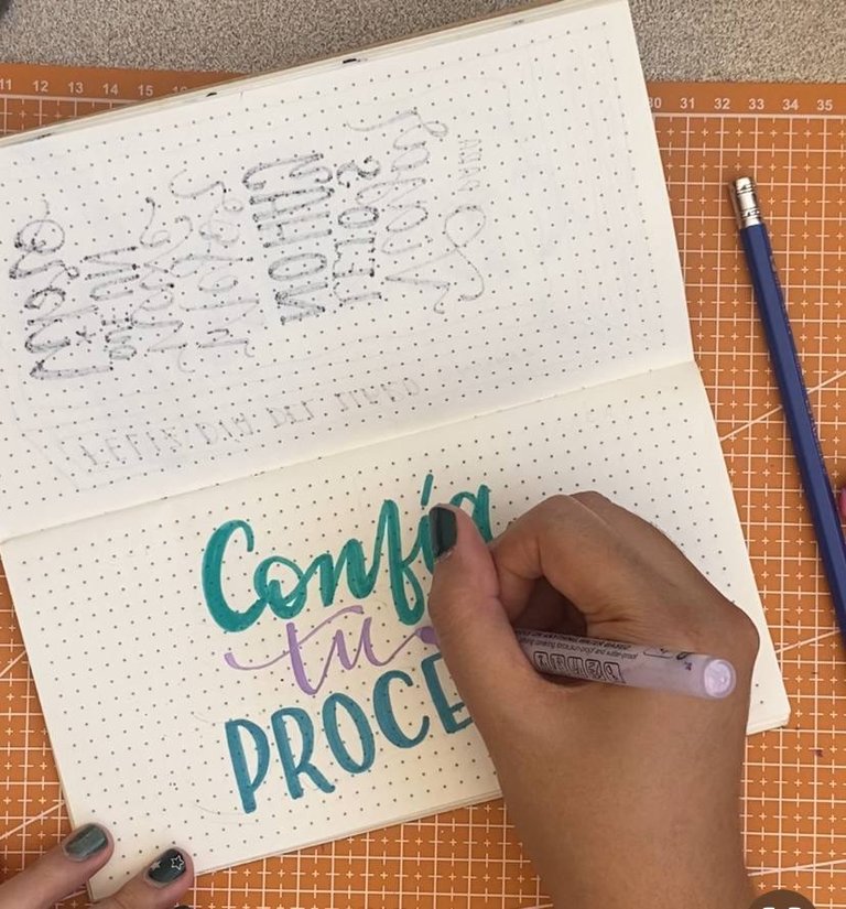
Para “tu” use un estilo cursivo pero más delicado y fluido con un tono lila. Para “en” use un marcador negro punta ultrafina, la verdad no queria que destacara al ser un conectivo.
 |  |
|---|
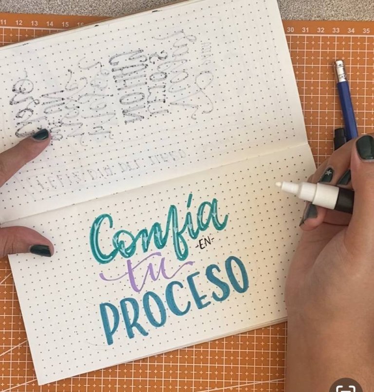
Ya con las bases hechas, empecé con los detalles. Para “Confía” use un marcador blanco y añadi una línea con un corazón como detalle al trazo que baja de cada letra. Para “proceso” use el mismo efecto, pero sin el corazón.
 |  |
|---|
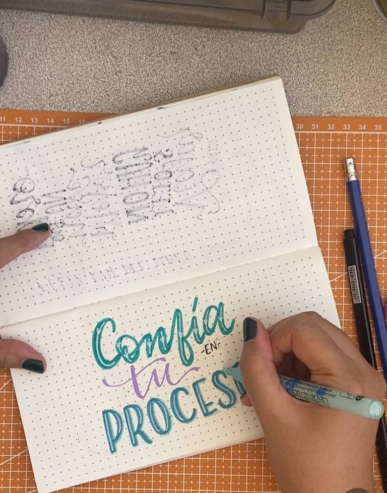
Aproveche y les hice delineados siguiendo el patrón de lo quería la sombra. Para “Confía” use un turquesa oscuro, mientras que para “proceso” use un turquesa muy clarito. Para “tu” use un morado más intenso.
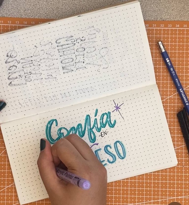
Con las letras listas, añadí unos destellos con dos tonos de morado.
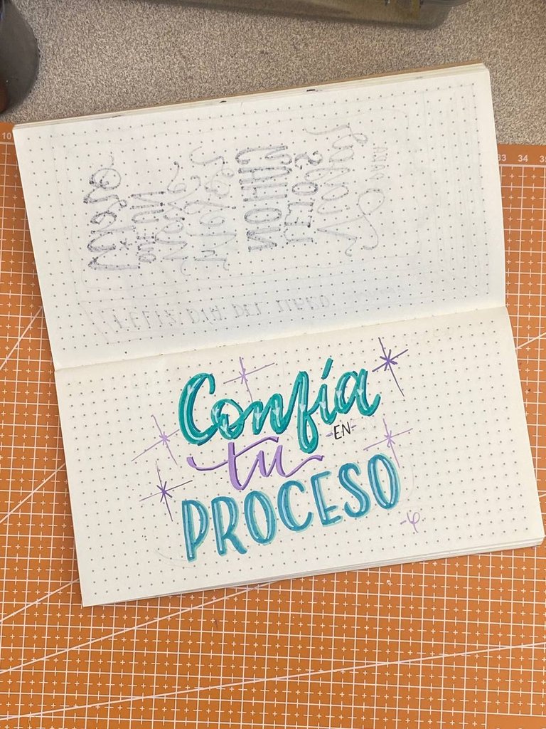
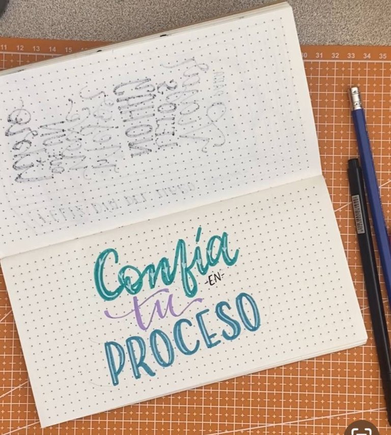
Y listo, tenemos una preciosa composición que nos recuerda que así no tengamos certeza y nos estemos muriendo del miedo debemos confiar en el proceso que vivimos cada uno con fe de que todo va a mejorar.
Gracias por leerme
Con cariño, G.
Hi hivers! 💜
I hope you are well and happy. The [art and wellness] initiative (https://peakd.com/hive-134572/@holos-lotus/creative-challenge-art-that-nourishes-wellness-through-our-hands) between @holoslotus and @hivearte has me super happy and excited, I literally feel like a fish in water and I love being able to share with you things that help me heal and one of those things is lettering.
Lettering is the most beautiful way I have to tell me things, but above all making compositions of positive phrases helps me a lot. Positive phrases full of beautiful letters with bright colors or that comfort you have a positive effect on people and can help them to change their mood.
These days have been a bit strong for me for personal reasons. So to find a little bit of peace I decided to illustrate a phrase that always calms me: “Trust your process”. Literally it is a phrase that I have illustrated in many ways and drawing it helps me to find peace. I will show you how I did this composition:
The first thing was to make a sketch. Lettering compositions are like puzzles where each word is a piece to fit together. I like to use distortion boxes to shape the letters. In this case, I chose one wave for the word “Trust” and another wave for “process”. For “your” use the space between “trust” and “process” and figure out how to fit it. The connector “en” also fit under “confia”.
Then I chose a color palette that I love: turquoise and purple in acrylic paint markers. I started with “Trust” in turquoise in a cursive style, making the thick stroke a little thicker than usual.
I followed with “process” in a shade between turquoise and blue, but using straight letters with the middle line lower, that makes the letters look more fun and fresh.
For “your” I used a cursive style but more delicate and fluid with a lilac tone. For “en” I used an ultra-fine black marker, I really didn't want it to stand out as it was a connective.
| |
|---|
With the bases done, I started with the details. For “Trust” I used a white marker and added a line with a heart as a detail to the line that goes down from each letter. For “process” I used the same effect, but without the heart.
| |
|---|
I took advantage of the opportunity and outlined them following the pattern of what the shadow wanted. For “trust” I used a dark turquoise, while for “process” I used a very light turquoise. For “your” I used a deeper purple.
With the letters ready, I added some sparkles with two shades of purple.
And that's it, we have a beautiful composition that reminds us that even if we are not sure and we are dying of fear, we must trust in the process we are living with faith that everything is going to get better.
Thank you for reading me
With love, G..
FUENTE
Fotos: iphone 11
Traducción: Deepl
SOURCE
Photos: iphone 11
Translation: Deepl
Un hermoso arte el del lettering, lo más divertido es crear estas frases tan lindas y motivadoras, me encantó, saludos.😍
Sííí, es la mejor parte. Así hagas una misma frase siempre encontraras formas de hacer variaciones. Saludos💜