would really love to see more designs like this being used at hive related events. I hate the boring corporate feel of an all white background and a logo with just the name. We need more style and variation in design. Just keeping some form of the logo and hive font is good enough to keep consistency.
would really love to see more designs like this being used at hive related events. I hate the boring corporate feel of an all white background and a logo with just the name. We need more style and variation in design. Just keeping some form of the logo and hive font is good enough to keep consistency.
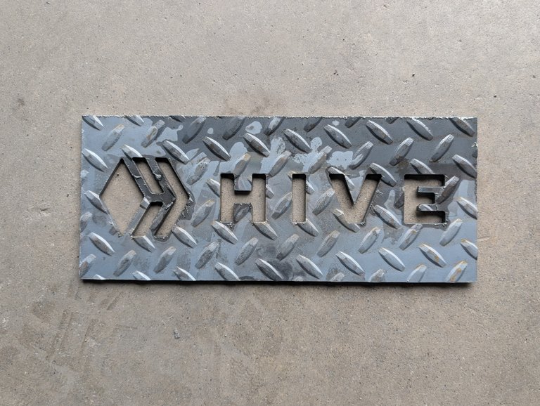
Oh, I love this. You did a nice job Dylan.