Different Moods by different Edits: Sea Gull Edition // Verschiedene Stimmung durch verschiedene Edits: Möwen Edition (DE/ENG)


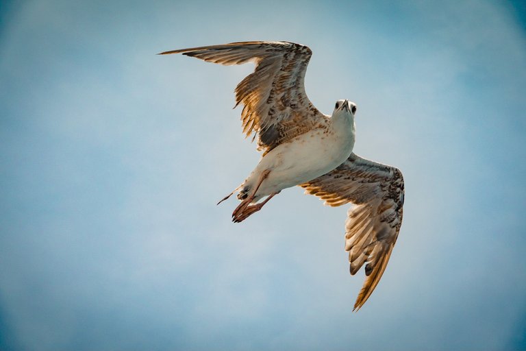
The cover picture is intentionally very gloomy - the highlights in the plumage, the dark brown together with a milky white background make the seagull look quite majestic to me. (Maybe even a little threatening) Since the gull was flying a few metres above me, another angle was not possible. When we photograph an object from below, this gives the whole impression, makes it look bigger - that's why editing to reflect this was important to me. I think that worked well so far. The fact that the head is tilted in the rough direction of the camera underlines the whole thing.
For comparison the high-key edit:
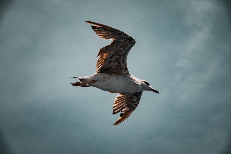
In this picture we can see the plumage particularly well, how the individual feathers together form a pattern. I especially like the way the sun shines through the feathers, and you can see the overlapping of the individual feathers very clearly. To me, the picture seems almost cheerful compared to the "gloomy" pictures above. I myself no longer perceive the seagull as majestic but - simply as a seagull - even though I still like the picture.
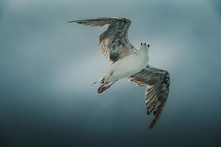
The only difference to the cover picture is that the seagull is now flying straight out and looking away from the camera. Although the style is 1 to 1 the same, the picture doesn't have nearly as strong an effect on me as the cover picture. In moments like this, I always remind myself that photography sometimes has a lot to do with luck - and timing. Probably also the reason why my Lightroom library contains many, many pictures of seagulls (apart from the holiday thing 😝). I remember about a year ago I was on a ferry positioned to photograph through an orange life ring - and tried for almost 30 minutes to photograph a seagull in flight positioned in the middle of the life ring with the seagull's orange beak visible. Doubly difficult because not all gulls have a strong orange beak. Of course it didn't work. That's why many photos sometimes just have something to do with luck.
So back to what I think is the better photo. In the previous versions I more or less only adjusted the colour of the background, but left the blurring purely to the focal length or the F-stop.
So I smoothed the background by noise reduction and blurring - the whole thing didn't fit to the first version of the edit, because the gloomy mood was emphasised by the contrast of the clouds, among other things. Accordingly, a new adjustment was necessary - but since the seagull didn't stand out enough to my taste, I used an oval selection circle to increase the brightness in the middle of the seagull as well as in the background. The sky serves as a kind of very soft vignette - I like that.
At the same time, the picture looks as if it was taken in very cloudy weather in which the light was almost perfectly defuse.

I am known to be a fan of brown tones, here the background complements the seagull's plumage - I admit it makes the background look a bit "dirty". So one could fantasise that maybe this picture was taken in very bad air or even near a fire? In general, the picture looks very expressive to me - even if I wouldn't frame the whole thing and hang it on the wall. 🤣


Das Titelbild ist beabsichtigt sehr Düster gehalten - durch die Highlights im Gefieder, das dunkle braun zusammen mit einem Milchweißen Hintergrund wirkt, die Möwe auf mich recht majestätisch. (Vielleicht sogar etwas bedrohlich) Da die Möwe einige Meter über mir geflogen ist, war ein anderer Winkel auch nicht möglich. Wenn wir ein Objekt von unteren fotografieren, verleiht dies dem ganzen Eindruck, lässt es größer wirken - deswegen war für mich eine Editierung die dies widerspiegelt wichtig. Glaube das hat soweit gut geklappt. Das der Kopf dabei in die grobe Richtung der Kamera geneigt ist unterstreicht das Ganze nochmal.
Zum Vergleich der High-Key Edit:
Wir sehen in dem Bild besonders toll das Gefieder, wie die einzelnen Federn zusammen ein Muster ergeben. Mir gefällt hier besonders wie die Sonne durch die Federn scheint, und man die Überlagerungen der einzelnen Federn sehr stark erkennen kann. Auf mich wirkt das Bild im Vergleich zum "düsteren" Bilder drüber schon fast fröhlich. Ich selber empfinde die Möwe nun nicht mehr als Majestätisch sondern - einfach nur als Möwe - auch wenn mir das Bild trotzdem gefällt.
Der einzige Unterschied zum Titelbild besteht darin, dass die Möwe nun gerade aus fliegt und von der Kamera wegschaut. Obwohl der Stil 1 zu 1 der selbe ist, wirkt das Bild nichtmal annähernd so stark auf mich wie das Titelbild. In solchen Momenten halte ich mir immer vor Augen, dass Fotografie manchmal einfach extrem viel mit Glück zutun hat - und Timing. Vermutlich aber auch der Grund warum meine Lightroom Library viele, viele Bilder von Möwen beinhaltet (abgesehen von der Urlaubssache 😝). Ich erinner mich dass ich vor knapp einem Jahr auf einer Fähre so positioniert war, dass ich durch einen orangenen Rettungsring fotografieren konnte - und fast 30 Minuten lang versuchte habe, eine Möwe im Flug so zu fotografieren, dass sie Mittig im Rettungsring positioniert ist, während der Orangene Schnabel der Möwe zu sehen ist. Doppelt schwierig weil nicht alle Möwen einen stark orangenen Schnabel haben. Hat natürlich nicht geklappt. Deswegen haben viele Fotos manchmal einfach was mit Glück zutun.
Also wieder zurück zu dem meiner Meinung nach besseren Foto. In den vorherigen Versionen habe ich den Hintergrund mehr oder weniger nur farblich angepasst, aber die Unschärfe rein der Brennweite bzw. dem F-Stop überlassen.
Den Hintergrund habe ich also durch Rauschreduzierung und Unschärfe geglättet - zur ersten Version des Edits hat das ganze nicht gepasst, weil die Düstere Stimmung unteranderem von dem Kontrast der Wolken betont wurde. Dementsprechend war eine neue Anpassung nötig - da sich die Möwe aber nach meinem Geschmack nicht genug abgehoben hat, habe ich per Ovalem Auswahlkreis die Helligkeit sowohl in Mitte der Möwe, als auch im Hintergrund erhöht. Der Himmel dient mir damit als eine Art sehr softe Vignette - das mag ich.
Gleichzeitig wirkt das Bild damit so, als wäre es bei sehr wolkigem Wetter aufgenommen in dem das Licht fast perfekt Defuse gewesen ist.
Ich bin ja bekanntlich ein Fan von Brauntönen, hier ergänzt sich der Hintergrund mit dem Gefieder der Möwe - ich geb zu der Hintergrund wirkt dadurch etwas "dreckig". Also könnte man fantasieren, dass dieses Bild vielleicht bei sehr schlechter Luft oder sogar in der nähe eines Brandes aufgenommen worden ist? Im Allgemeinen wirkt das Bild auf mich sehr Ausdrucksstark - auch wenn ich mir das Ganze nicht einrahmen und an die Wand hängen würde. 🤣

Falls dir meine Beiträge gefallen, vielleicht möchtest du mir bei HIVE.VOTE folgen. Darüber würde ich mich riesig freuen 😊
If you like my posts, maybe you would like to follow me at HIVE.VOTE. That would make me very happy 😊
A great capture. I'd rather prefer 'hi-key' version - if it had no yellowish tones - too colourful imo. So, from the given options, I 'd go for the brown version ;-)
https://images.ecency.com/p/RGgukq5E6HBS5x5bTLMHECZdKFNmFJBEzUUWijx6MEpBA9y5Pga4VGm43VjXnwp2Qdj3eK2U7h3v1amHLLgpEHAb58wkmCkMygs7SPjE5UJzx7UkoCLnrZAZ4oCxkiR.webp?format=webp&mode=fit
!DHEDGE
Yeah I see the issue with the yellowish tones now. Funny how if you point it out I instant realize it 😄 now I can't unsee it :D
Something like this?
!PIZZA
yes, exactly! this to me is a better verion.
NB. when yellow is being added to the grey or neutral tones, it adds 'warmth' but also adds 'dirty' impression. so removing yellowish tint from the mix, makes it more shiny and fresh. at least thats how my eyes see it. If i'd was Gogen, maybe I'd say something different, but I am not Gogen :D
This post has been selected for upvote from our token accounts by @qwerrie! Based on your tags you received upvotes from the following account(s):
- @dhedge.bonus
- @dhedge.ctp
- @dhedge.pob
- @dhedge.neoxag
- @dhedge.waiv
- @dhedge.alive
@qwerrie has 10 vote calls left today.
Hold 10 or more DHEDGE to unlock daily dividends and gain access to upvote rounds on your posts from @dhedge. Hold 100 or more DHEDGE to unlock thread votes. Calling in our curation accounts currently has a minimum holding requirement of 100 DHEDGE. The more DHEDGE you hold, the higher upvote you can call in. Buy DHEDGE on Tribaldex or earn some daily by joining one of our many delegation pools at app.dhedge.cc.
Great photography of these flying animals.
Thank you very much!
$PIZZA slices delivered:
chrislybear tipped qwerrie
@chrislybear(5/5) tipped @erikah
I am a fan of brown tones too but you did well as all the edits look lovely.
Thank you very much! Glad you like it ☺️
!PIZZA
Congratulations @chrislybear! You have completed the following achievement on the Hive blockchain And have been rewarded with New badge(s)
Your next target is to reach 45000 upvotes.
You can view your badges on your board and compare yourself to others in the Ranking
If you no longer want to receive notifications, reply to this comment with the word
STOP